Insert the usual palaver about how time flies, etc., or spare the both of us, but it's been almost ten years since I published my last xerox mag. Not only that, almost ten years since I finished writing a piece of fiction. Until I started this blog in 2006, the zine reproduced below was the last thing to appear under the Colicky Baby Records and Tapes imprint. Dating back to fall 2000, here it is, issue number two of GmbH.
GmbH, as you might have figured, ran for a short span of two issues. The title is a business entity designation used in Austria, Germany, and Switzerland; it's an abbreviation for Gesellschaft mit beschränkter Haftung, which translates to "limited liability corporation."
I chose the name primarily because it looks to me like an unpronounceable faux-expletive. "Consarn razza frazzit!
GmbH!!!"
But I also chose it because it connoted sleek industrial modernism -- particularly the kind of sleek industrial modernism pervasive in the typographic arts revolution that took place in Germany and Switzerland in the 20th century. (And since we all know what 20th century German modernism led to, the assertion of "limited liability" added a layer of meaning, as in, "We were just following orders," or "We didn't do any genociding; only the Nazis, the bad Germans, did that; besides, we weren't even born yet.")
Anyway, in 2000, I was very interested in typography, particularly typeface design. I was especially interested in
Jan Tschichold -- so the first issue of
GmbH was devoted to him.
Well ... not exactly.
GmbH wasn't a fanzine about typography. Typography was just a hook, something to hang some silly short stories on. Really, it was just a starting point for jokes. I didn't know enough about typographic arts to teach anyone anything new about it -- or at least not anyone who was already interested in the topic. But I did know enough about it to make jokes.
So the general premise was that I would narrate these goofy short stories -- actually, would be a pivotal character in them -- involving various famous 20th century typographers, or typeface designers. Since these guys were all dead, I would have to be some kind of time traveler, or zonked-out mystic, or a combination of the two. And nothing really had to make any sense. There didn't need to be any plot, beyond what I thought was funny, and I could throw in lots of biographical data and factual trivia as distractions. While I was at it, I threw in some D.F. Wallace-ish footnotes or endnotes, just for fun.
The first issue turned out pretty well. Maybe I'll post that later. The second issue was a little trickier, and actually took me several weeks to thrash out. In the days before broadband, I actually used to kill time by writing and making Photoshop collages. Crazy.
For the second issue I decided to write about
Eric Gill. That was what made it tricky. I probably should have waited to cover Gill until I had zined up a few less confusing and intricate characters. Eric Gill was a complicated guy. Today, he's probably best known for designing a number of popular typefaces -- especially
Gill Sans -- but he was a lot more than a font guy.
Let's see ... how to sum up? Can't, really. But in case you don't want to go to Wikipedia, in a very brief nutshell, Eric Gill was an English Roman Catholic, a stonemason and sculptor, a printer, a back-to-the-country medievalist wacko, and a sex pervert.
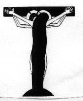
At that time -- and believe this or don't -- I was going through a sort of "religious phase." To be specific, my "Catholic phase." I didn't seriously consider converting -- but I frivolously considered it. Long story short, based on a combination of my interest in typographic arts and my interest in Roman Catholicism, I became fascinated by Gill's religious art, which quite often crossed a strange boundary line into eroticism. (The cover of
GmbH 2 excerpts a portion of one of Gill's most striking pieces, a wood engraving titled
"The Nuptials of God.") So I knew for quite a while that I was going to make some kind of mag about Gill; the reason I should have waited is, once I'd made the Gill zine, I had no idea how I was going to top it, just for sheer weirdness of subject matter. There just aren't any luminaries in the world of typography to match Eric Gill for nut-a-roony-tudinalism. So I pretty much had to give up on the
GmbH series right there. Sadly.
So here are a series of scans of the zine, which consists of four sheets of 8-1/2 x 11 paper folded in the middle and stapled. I probably distributed about 20 of them. Hi-rez pdfs available on request.
Below that, a digitized text reproduction of the story, complete with endnotes, which was difficult, because I had lost the original Word file. So, in conducting the exercise of building this blog post, I actually had to OCR-scan the story, then proofread it against the hard copy, paste it as plain text into Blogger, and add back any formatting (italics, font sizes, etc.). And because I'm geeky in that way, I had a pretty good time doing it.
So here it is.
Eric Gill
just as God made us
The discovery, then, of what is meant by ‘pleasantly readable’ involves more than questions of eye-strain, important tho’ that question is; it involves first and last a consideration of what is holy.
– Eric Gill, Typography
6/4/28 Expt. with Jan T. Spent 1/2 h. in his bed, placed p. in his a/hole.
Discovered that a Modernist will join with a man. This has to stop.
– diary entry
After a long journey[1] to Ditchling[2] on a shoestring budget I was distressed to learn that Eric Gill died of lung cancer on November 17, 1940. Having come this far, a short jaunt to the ruined monastery[3] at Capel-y-ffin[4] seemed ordinate. The Finns had the following to say about it: “Grange on toiminut jo 30 vuotta ja ratsastajat palaavat vuosi vuodelta ihailemaan upeita maisemia, nauttimaan luonnosta ja pakenemaan kaupungin aiheuttamaa stressiä.”[5] I was in no position to argue with that.
First fashioning a small effigy of Portland[6] stone dust and the blood of a leftover sacrificial chicken (not quite a proper Kaparot chicken; more of a Santeria chicken; I always have some on hand in the freezer along with vegetable scraps for a rainy day of atonement and a rich, gelatinous broth; I recommend it) I forced my brittle legs into the splits position and recited a careful prayer: “The Internet is not a fad.[7] Blessed is the fruits of its womb. And also with you.” The effigy exploded, blinding me temporarily. I rubbed my eyes for a few moments and when my vision returned I was greeted with the impassive stare of a three-foot-tall golem in the shape of a naked cupid. The golem took me by the hand and helped me to my feet. Motioning me to follow, the golem led me to a grotto hidden among sharp crags. A well-worn path led to a cave entrance. The golem refused to go further but encouraged me to continue. Proceeding slowly as my eyes grew accustomed to the darkness, I followed a narrow, twisting tunnel downward. Just as I was about to lose my nerve and turn back, I found a broken composing stick on the tunnel floor and several pieces of lead type. I remembered something someone had told me: “A distribution box is made of many compartments. Each letter, number, and character is assigned a specific box of its own.”[8] I went on.
Inching forward, I soon found myself in complete darkness. Clutching the tunnel wall, I proceeded carefully. After what felt like hours I was at once cheered and made apprehensive by the flicker of torchlight ahead. Pausing to take a deep breath, I perceived the sound of tapping in counterpoint to the sound of my beating heart. It was unmistakably the tapping of a chisel upon stone. Listening more carefully, I could hear a soft voice repeating the Ave Maria.
Emboldened, I turned the final corner and crossed a threshold into a remarkable chamber, a fully equipped print shop carved from the living rock. My wonderment at the room, however, was immediately eclipsed by what I saw next. Sprawled against a far wall was Eric Gill.[9] He was clad in his familiar mason’s smock,[10] with a heavy chain binding him to the floor by his neck. A cord and a small pile of stone beads were on the floor next to him. His smock was open, and he was hammering at a wide, bleeding gash in his gut. He turned his face toward me. “Aligheri? Is it you? I have a new chapter for you. Condemned to an eternity making rosaries of my own gallstones. An almost Promethean torment, surely a new circle of Hell. I’m proud, quite proud. God is great, beneficent.”[11]
“I’m a friend of Jan Tschichold’s,”[12] I said. “Or I used to be. We had a falling out,[13] and I left Germany.”[14]
“Oh? Was it the ‘isms’?”
“The what?”
“The isms.[15] Communism, Fascism, Anarchism, Modernism, Futurism, Vorticism, Cubism, Fauvism, Fabianism, Manicheanism, Zoroastrianism, Ironism, Sarcism – ”
“Sarcism?”
“Sarcasm, I meant to say.”
“But that’s more of an ‘asm.’ ”
“Mmm.”
“At any rate, no, it was none of those things.”
“Maybe it was Pantism. Could it have been Pantism?”
“What’s Pantism?”
“The ‘ism’ of everything.”
“That’s it!!!”
Gill flipped over backwards three times and landed on his ass. Laughing, he unclipped the chain from the wall and stood up. "I'm allowed a respite," he said. "Let's have something to drink, and talk."[16]
We spent the first few hours discussing the pure forms of letters,[17] before delving into territory I had intended to avoid — namely, typographic design,[18] the arrangement of elements on the printed page,[19] as opposed to the structure of letterforms qua letterforms, divorced from considerations such as page size and the golden mean, kerning and leading, etc, etc. I changed the subject by asking Gill what he hoped his legacy to be.
He scoffed. "I have no legacy. Books typeset my way will sit in libraries until they rot, but my truth has no life left, no duration as a living thing. I spent a lifetime mitigating the modern, taming the modern. After I died, modernism ran roughshod over England, Europe, the Americas, even Asia. And when modernism died of its gluttony, what was its successor? Postmodernism? Even worse! The “postmodern” typefaces are beyond ungodly, they are inhuman. ‘Platelet,’ designed by Conor Mangat in 1993,[20] may serve a purpose in certain advertisements, but it is hardly serious. ‘Dr. No,’ designed by Ian Anderson of the Designers Republic in 1992,[21] lacks any appeal whatsoever. Its ‘whimsy’ nauseates. ‘Volt,’ a face by Taylor Deupree,[22] is inoffensive, but that is the best that can be said about it. We could go on. We won’t go on.”
He pulled out a hymnal and invited me to sing, but I demurred. “You know what?” I said. “I actually worship text. The text IS God. It started out as a joke to say that, but I think I really believe it. Not just any text, though – COMPLETE text. Actualized text. Elegant text. In terms of the meaning and the depiction. What the text says and how it is presented. I'd make it a trinity, but I'm at a loss for number three right now. Maybe the reproduction. Yes. Meaning, presentation, reproduction. All are holy.”
“I'm proud of you.”
“I can’t think of text except in terms of these three coordinates.”
“Mmm.” He was leafing through the hymnal. He had lost a lot of blood. I was surprised he could sit upright. He turned his face toward me, but didn’t quite make eye contact. “You know, giant ducks used to rule the world.”
“Giant ducks?”
“Yes, fifteen feet tall, and carnivorous.”
“Giant flesh-eating ducks?”
“After the dinosaurs died.”
“They ruled the world?”
“They ruled the world! They didn’t just exist, they RAN things! Commerce, culture, government! Mass transit! The world!”
“Did they have text?”
“I don't know. But if they did ...”
“Did they have sheets and devices? And devices for sheets? Fifteen foot tall sheets! Devices that ate meat!”
He blinked, swallowed, took a breath. He shook his head. “Have you observed that the pattern of the veins in a rose’s petal is similar to that in the skin of a man’s scrotum, when it is stretched taut?”
That had escaped my notice, I told him.
“Although it barely resembles a dog’s.”
“A dog’s – ?”
“Scrotum, yes. Neither is the pattern like that of a pig’s, nor a goat’s, nor Ananda Coomaraswamy’s.”
“Uhhh.”
“Which is not to say that a Hindoo is more like a dog than a man. I regret that work on the Stations of the Cross for Westminster Cathedral diverted me from this course of study before I could properly examine a cow’s.”
“A bull’s, you mean.”
“Ha ha! Of course! Coomaraswamy’s, let it be noted, bore resemblances to a lotus blossom stained with pekoe.”
“Pekoe? Not oolong?”
“No, just a few centimetres. Poor man.”
He coughed. “The nitre,” he gasped, and coughed again. “The nitre! For the love of God, Montresor!”
“Nitre? Saltpeter? Perhaps you could have used that while — “
He waved his arm to silence me. He grabbed a bottle of cheap sherry from a sideboard and opened it. He took a swig, which seemed to stifle his cough. “The best advice I can give you is this. It may be the best advice you get. My advice is to treat difficult text as if it were a recalcitrant lover. Cajole it tenderly and together you and it will find the form that is best for you both.”
“Typography as seduction.”
“No. Typography as caress.”
“I think I see what you mean. You must make compromises based on needs of the text that vary from your own needs.”
“I wouldn’t call it compromise. Never compromise. Stone has grain but the carver doesn’t compromise with it. Rivers have courses but the water doesn’t compromise with the riverbed. Just be open to the fact that finding the truth is a collaborative process, between lovers, between artist and medium, between man and God.”
“Ah. As the stylus of a pantograph floats slightly, and doesn’t force itself, or else the copy will be flawed.”
“Yes, this is along the natural lines.”
Endnotes
1 By foot, rail, horseback, steamship, aeroplane, jitney, hackney, catamaran, airship, junk, funicular, limousine, stagecoach, autogyro, time machine, pogostick, luge, bicycle, piggyback ride, surfboard, trebuchet, barge, etc., etc. Mostly borrowed. See Le Surmale (1902) by A. Jarry for a fanciful exaggeration on the rail portion of my journey, somehow described a handful of numbers of years before it took place, give or take. I had left Berlin in 1928 with intentions of reaching Ditchling by 1920. As a result of a simple miscalculation on my part (I should have known better than to make sensitive adjustments while impassioned) I arrived several trillion years ahead of schedule, specifically, in October 1941.
2 Sussex.
3 Llanthony Monastery, founded by 'Father Ignatiuus,' (Rev. Joseph Lyne, 1837-1908) in 1869, elevation 1,150 ft.
4 Wales. The name means "Chapel of the boundary."
5 < http://freespace.virgin.net/oxford.travel/fmnish/f grange I .html > The Internet is not a fad! However, if in fact it is, you may get a 404 error when you enter this URL.
6 Mostly. Some admixture with Beer, Bath, and Hoptonwood.
7 But if in fact it is, see, generally, endnote 5, supra.
8 I couldn't go on.
9 Typographer, sculptor, essayist. Born February 22, 1882. Died November ... wait, I said that already.
10 He was, according to his usual custom, garbed otherwise just as God made him.
11 Misquote of Qur'an, Surah 55, "Ar-Rahman" (?)
12 See, generally, GmbH issue one.
13 Devices of jealousy sheets, covetousness devices, sheet after sheet of ... no, I can't lie. It was a woman. Pour ainsi parler.
14 A small Alpine country. Known for Volk dances and colorful oratory.
15 Years later, Edgar Reitz and I were snowbound in a hotel in Alsace. There was nothing to do but hole up with a few bottles of schnapps and watch the American miniseries "Holocaust," then being broadcast for the first time in Deutschland. Drunk since morning, Reitz fell into a violent rage. "Zionismus!" he shouted. I tried to calm him down, gently at first, but when gentleness failed I was forced to smash an empty bottle against a bedpost and hold its jagged neck against Reitz's wet, swollen, red tongue until he collapsed into a long, dreamless sleep.
16 Gill drank a tepid, odorless chicory infusion. He nibbled on a dull cake that looked like tsampa (or tsampa-shaped marzipan) which he refused to share with me because I declined to join him in prayer. I had come to discuss typefaces, not to say graces.
17 Body sizes, x-heights, line weights, cap heights, character widths, adnate serifs, slab serifs, squared serifs, abrupt serifs, teardrops, ball terminals, beak terminals, bowls, and other dimensions of God's descriptive devices at their atomic level.
18 For we certainly had more philosophical and aesthetic differences than sympathies, insofar as that subject was concerned. I had devoted my youth to machinery, speed, war, action, dynamism, automation, technology, efficiency, the new, the future. Gill lived in the past. Baked his own bread, lived without electricity, sought quietude and constancy and eschewed all aspects of the Twentieth Century. By designing typefaces for machine punch-cutting, Gill showed some flexibility and willingness to accept technological progress. But from a design standpoint, Gill was decidedly backward-looking. His ornate, lavishly decorated initial letters alone would have been sufficient to induce a fatal paroxysm in Jan Tschichold.
19 Typeface design and typographic design are often confused and conflated. The difference is like that between defining musical scales and arranging orchestras.
20-22 [Postmodern typefaces not reproducible]
[The editors would like to eknowledge John R for reference - eds.]


